 手写布局
手写布局
# 页面布局
# 先序知识
关于margin的负值问题
margin-top元素自身会向上移动,同时会影响下方的元素会向上移动;margin-bottom元素自身不会位移,但是会减少自身供css读取的高度,从而影响下方的元素会向上移动。margin-left元素自身会向左移动,同时会影响其它元素;margin-right元素自身不会位移,但是会减少自身供css读取的宽度,从而影响右侧的元素会向左移动;
原理:
top负值就是以包含块(Containing block)内容区域的上边或者上方相连元素margin的下边为参考线;left负值就是以包含块(Containing block)内容区域的左边或者左方相连元素margin的右边为参考线;right负值就是以元素本身border的右边为参考线;bottom负值就是以元素本身border的下边为参考线;
举几个🌰
<style>
  * {
    margin: 0;
    padding: 0;
  }

  body {
    width: 100vw;
    height: 100vh;
    display: flex;
    align-items: center;
    justify-content: center;
  }

  .container {
    width: 400px;
    box-sizing: border-box;
    height: 400px;
    background: blue;
  }

  .green {
    width: 200px;
    height: 200px;
    background: green;
  }

  .yellow {
    width: 200px;
    height: 200px;
    background: yellow;
  }
</style>
</head>

<body>
  <div class="container">
    <div class="green"></div>
    <div class="yellow"></div>
  </div>
</body>
2
3
4
5
6
7
8
9
10
11
12
13
14
15
16
17
18
19
20
21
22
23
24
25
26
27
28
29
30
31
32
33
34
35
36
37
38
39
40
41
效果如下图: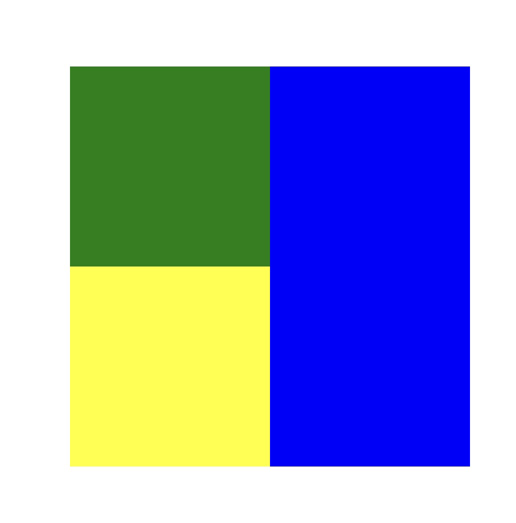
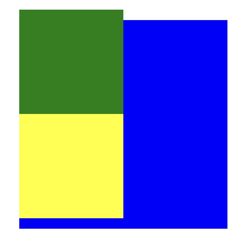
// 添加margin-top负值,元素自身会向上移动,同时会影响下方的元素会向上移动
.green {
  background: red;
  margin-top: -20px;
}
2
3
4
5
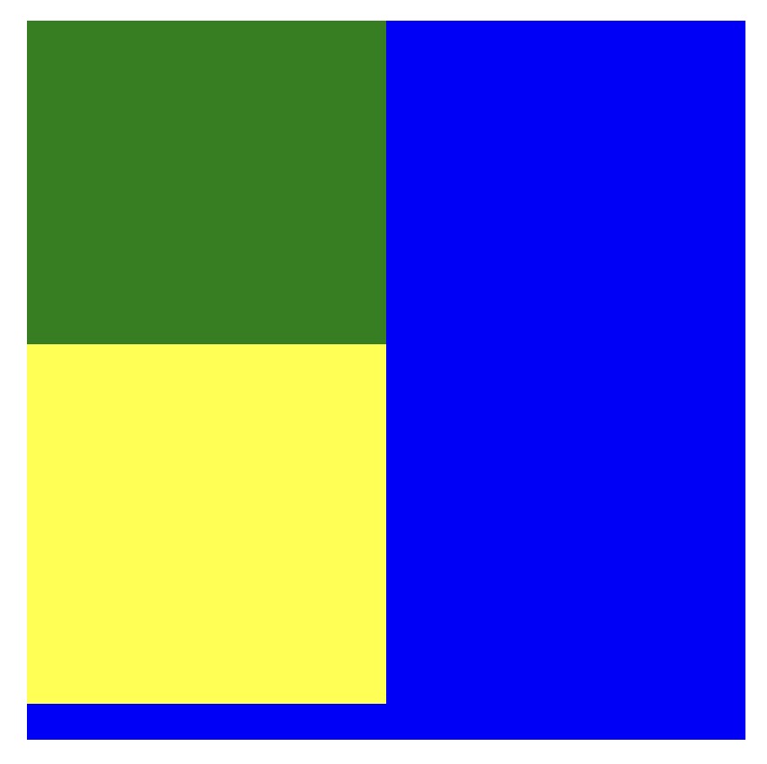
// 添加margin-bottom负值 元素自身不会位移,但是会减少自身供css读取的高度,从而影响下方的元素会向上移动
.green {
  background: red;
  margin-bottom: -20px;
}
2
3
4
5
// 添加margin-left同时让绿黄盒子一行显示 元素自身会向左移动,同时会影响其它元素;
.container {
  letter-spacing: -8px;
}
.green {
  display: inline-block;
  background: red;
  margin-left: -20px;
}
.yellow {
	display: inline-block;
}
2
3
4
5
6
7
8
9
10
11
12
// 添加margin-right同时让绿黄盒子一行显示 元素自身不会位移,但是会减少自身供css读取的宽度,从而影响右侧的元素会向左移动
.container {
  letter-spacing: -8px;
}
.green {
  display: inline-block;
  background: red;
  margin-right: -20px;
}
.yellow {
	display: inline-block;
}
2
3
4
5
6
7
8
9
10
11
12
but padding不能设置为负值
于此同时margin 和 padding如果是利用百分比的话则是相对于最近的块级父盒子的宽度
笔记
为什么是%是相对于最近的块级父元素?
如果没有为元素声明width在这种情况下,元素框的总宽度包括外边距取决于父元素的width,这样可能得到“流式”页面,即元素的外边距会扩大或缩小以适应父元素的实际大小。如果对这个文档设置样式,使其元素使用百分数外边距,当用户修改浏览窗口的宽度时,外边距会随之扩大或缩小
为什么是相对于width而不是height
我们认为,正常流中的大多数元素都会足够高以包含其后代元素(包括外边距),如果一个元素的上下外边距是父元素的height的百分数,就可能导致一个无限循环,父元素的height会增加,以适应后代元素上下外边距的增加,而相应的,上下外边距因为父元素height的增加也会增加,如果循环,就死循环了。
# 单行 多行文本溢出隐藏
单行
{
   overflow: hidden;            // 溢出隐藏
   text-overflow: ellipsis;      // 溢出用省略号显示
   white-space: nowrap;         // 规定段落中的文本不进行换行
}
2
3
4
5
多行
{
   overflow: hidden;            // 溢出隐藏
   text-overflow: ellipsis;     // 溢出用省略号显示
   display:-webkit-box;         // 作为弹性伸缩盒子模型显示。
   -webkit-box-orient:vertical; // 设置伸缩盒子的子元素排列方式:从上到下垂直排列
   -webkit-line-clamp:3;        // 显示的行数
}
2
3
4
5
6
7
# 实现两栏布局
左边固定 右边自适应
法一:利用浮动 左边宽
200px浮动在左边,右边设置margin-left: 200px宽度auto(默认auto撑满父元素)
.container {
	height: 200px;
	background: black;
}

.left {
  width: 200px;
  height: 200px;
  float: left;
  background-color: yellow;
}

.right {
  margin-left: 200px;
  width: auto;
  height: 200px;
  background-color: aqua;
}
2
3
4
5
6
7
8
9
10
11
12
13
14
15
16
17
18
法二: 左边
css不变,右边设置overflow: hidden让右边触发BFC不会与浮动元素发生重叠
.container {
  height: 200px;
  background: black;
}

.left {
  width: 200px;
  height: 200px;
  float: left;
  background-color: yellow;
}

.right {
  overflow: hidden;
  width: auto;
  height: 200px;
  background-color: aqua;
}
2
3
4
5
6
7
8
9
10
11
12
13
14
15
16
17
18
法三:利用
flex布局 左边固定200px右边flex:1撑开
.container {
  display: flex;
  height: 200px;
  background-color: red;
}

.left {
  width: 200px;
  background-color: yellow;
}

.right {
  flex: 1;
  background-color: aqua;
}
2
3
4
5
6
7
8
9
10
11
12
13
14
15
法四:父元素相对定位 子元素绝对定位并设置宽度
.container {
  position: relative;
  height: 200px;
  background-color: red;
}

.left {
  position: absolute;
  width: 200px;
  height: 200px;
  background-color: yellow;
}

.right {
  height: 200px;
  margin-left: 200px;
  background-color: aqua;
}
2
3
4
5
6
7
8
9
10
11
12
13
14
15
16
17
18
法五:父元素相对定位 子元素中的右边元素设置绝对定位
left设置为200px
.container {
  position: relative;
  background-color: red;
  height: 200px;
}

.left {
  width: 200px;
  background-color: yellow;
}

.right {
  position: absolute;
  top: 0;
  left: 200px;
  right: 0;
  bottom: 0;
  background-color: aqua;
}
2
3
4
5
6
7
8
9
10
11
12
13
14
15
16
17
18
19
法六:使用
margin负边距
.container {
  width: 100%;
}

.left {
  width: 100px;
  height: 400px;
  background-color: blue;
}

.right {
  height: 400px;
  margin: -400px 0 0 100px;
  background-color: green;
}
2
3
4
5
6
7
8
9
10
11
12
13
14
15
# 实现两个div 一个高度100px 另一个高度自适应进阶
flex
改变了主轴方向为纵向,然后设置后面的元素换行
值得注意的是
flex-flow是flex-direction和flex-wrap的简写,分别是主轴方向和换行方式
* {
  height: 100%;
  margin: 0;
  padding: 0;
}
.container {
  display: flex;
  flex-flow: column wrap;
}

.parent {
  height: 100px;
  background: red;
}

.child {
  flex: 1;
  background: green;
}
2
3
4
5
6
7
8
9
10
11
12
13
14
15
16
17
18
19
定位
* {
  height: 100%;
  margin: 0;
  padding: 0;
}
.container {
  position: relative;
  width: auto;
}

.parent {
  height: 100px;
  background: red;
}

.child {
  position: absolute;
  top: 100px;
  left: 0;
  right: 0;
  bottom: 0;
  background: green;
}
2
3
4
5
6
7
8
9
10
11
12
13
14
15
16
17
18
19
20
21
22
23
# 实现三栏布局
三栏布局一般是左右两栏宽度固定,中间自适应
基础结构:
    <div class="container">
      <div class="left"></div>
      <div class="center"></div>
      <div class="right"></div>
    </div>
2
3
4
5
利用绝对定位,左右设置为绝对定位,中间设置为对应大小的
margin值
缺点:如果中间栏有最小宽度的限制或者中间栏有含有宽度的元素,当浏览器宽度小到一定程度会发生重叠
.container {
	position: relative;
	height: 100px;
}

.left {
	position: absolute;
	width: 100px;
	height: 100px;
	background: tomato;
}

.right {
	position: absolute;
	top: 0;
	right: 0;
	width: 200px;
	height: 100px;
	background: gold;
}

.center {
	margin-left: 100px;
	margin-right: 200px;
	height: 100px;
	background: lightgreen;
}
2
3
4
5
6
7
8
9
10
11
12
13
14
15
16
17
18
19
20
21
22
23
24
25
26
27
利用左右浮动然后中间的设置左右的
margin,在结构中center放在right后面
暂时没有什么缺点
.container {
  height: 100px;
}

.left {
  float: left;
  width: 100px;
  height: 100px;
  background: tomato;
}

.right {
  float: right;
  width: 200px;
  height: 100px;
  background: gold;
}

.center {
  height: 100px;
  margin-left: 100px;
  margin-right: 200px;
  background: lightgreen;
}
2
3
4
5
6
7
8
9
10
11
12
13
14
15
16
17
18
19
20
21
22
23
24
利用
flex布局,左右两栏设置固定大小,中间栏设置flex: 1
缺点:它在缩到一定小的时候,左栏和右栏会只剩下一个center栏
.container {
  display: flex;
  height: 100px;
}

.left {
  width: 100px;
  background: tomato;
}

.right {
  width: 100px;
  background: gold;
}

.center {
  flex: 1;
  background: lightgreen;
}
2
3
4
5
6
7
8
9
10
11
12
13
14
15
16
17
18
19
圣杯模式
html的结构center要放在最前面,要用100%因为中间栏需要根据浏览器宽度的变化而变化
左右栏无法上去,将左栏-100px后发现left上去了,因为负值到窗口外没位置了,只能往上挪
但是左右栏上去之后由于container有padding,所以左右栏盖住了center,用相对定位将他们挪出去就是最终结果
当resize浏览器窗口的时候会发现不同于flex,它在缩到一定小的时候,左栏和右栏不会消失,而上面的flex方法就会只剩下一个center栏
缺点是当
center宽度小于两边的时候 布局可能会错乱
值得注意的是
元素结构次序分别是 center left right
.container {
  height: 100px;
  padding-left: 100px;
  padding-right: 200px;
}

.left {
  position: relative;
  left: -100px;

  float: left;
  margin-left: -100%;

  width: 100px;
  height: 100px;
  background: tomato;
}

.right {
  position: relative;
  right: -200px;

  float: left;
  margin-left: -200px;

  width: 200px;
  height: 100px;
  background: gold;
}

.center {
  float: left;

  width: 100%;
  height: 100px;
  background: lightgreen;
}
2
3
4
5
6
7
8
9
10
11
12
13
14
15
16
17
18
19
20
21
22
23
24
25
26
27
28
29
30
31
32
33
34
35
36
37
双飞翼布局
去除了left和right的相对定位,同时保留了left和right的负边距顶到跟center栏同一行
而用了wrapper包裹着了center,这个wrapper同时也在left和right的上层,但是center设置了左右margin,让left和right栏露出来
她的实际效果和圣杯布局的完全一样
// html结构
<div class="container">
	<div class="wrapper">
		<div class="center"></div>
	</div>
	<div class="left"></div>
	<div class="right"></div>
</div>
2
3
4
5
6
7
8
.container {
  height: 100px;
}

.left {
  float: left;
  margin-left: -100%;

  width: 100px;
  height: 100px;
  background: tomato;
}

.right {
  float: left;
  margin-left: -200px;

  width: 200px;
  height: 100px;
  background: gold;
}

.wrapper {
  float: left;

  width: 100%;
  height: 100px;
  background: lightgreen;
}

.center {
  margin-left: 100px;
  margin-right: 200px;
  height: 100px;
}
2
3
4
5
6
7
8
9
10
11
12
13
14
15
16
17
18
19
20
21
22
23
24
25
26
27
28
29
30
31
32
33
34
35
# 实现三个div 上下两个高度100px 中间高度自适应进阶
html结构
<div class="container">
  <div class="top"></div>
  <div class="center"></div>
  <div class="bottom"></div>
</div>
2
3
4
5
flex
* {
  margin: 0;
  padding: 0;
  height: 100%;
}
.container {
  display: flex;
  flex-direction: column;
}
.top {
  height: 100px;
  background-color: pink;
}

.center {
  flex: 1;
  background-color: aqua;
}
.bottom {
  height: 100px;
  background-color: black;
}
2
3
4
5
6
7
8
9
10
11
12
13
14
15
16
17
18
19
20
21
22
定位
* {
  margin: 0;
  padding: 0;
  height: 100%;
}
.container {
  position: relative;
}
.container > div {
  position: absolute;
  width: 100%;
}
.top {
  top: 0;
  height: 100px;
  background-color: pink;
}

.center {
  top: 100px;
  bottom: 100px;
  background-color: aqua;
}
.bottom {
  bottom: 0;
  height: 100px;
  background-color: black;
}
2
3
4
5
6
7
8
9
10
11
12
13
14
15
16
17
18
19
20
21
22
23
24
25
26
27
28
# 各屏幕大小下可自适应的多宫格元素排列布局
Grid
.grid-container {
  display: grid;
	//auto-fill + minmax():自动填充列,最小宽度 150px,最大占满剩余空间。
  grid-template-columns: repeat(auto-fill, minmax(150px, 1fr));
  gap: 1rem;
}

<div class="grid-container">
  <div class="grid-item">1</div>
  <div class="grid-item">2</div>
  <div class="grid-item">3</div>
  ...
</div>
2
3
4
5
6
7
8
9
10
11
12
13
14
Flex
.flex-grid {
  display: flex;
  flex-wrap: wrap;
  gap: 1rem;
}

.flex-grid .item {
  flex: 1 1 calc(25% - 1rem);
}

@media (max-width: 768px) {
  .flex-grid .item {
    flex: 1 1 calc(50% - 1rem);
  }
}

@media (max-width: 480px) {
  .flex-grid .item {
    flex: 1 1 100%;
  }
}
2
3
4
5
6
7
8
9
10
11
12
13
14
15
16
17
18
19
20
21
# 水平垂直居中的实现
# 水平居中的方法
- 元素为行内元素,设置父元素
text-align:center - 如果元素宽度固定,可以设置左右
margin为auto; - 绝对定位和移动:
absolute + transform - 使用
flex-box布局,指定justify-content属性为center display设置为tabel-ceil
# 垂直居中的方法
- 将显示方式设置为表格,
display:table-cell,同时设置vertial-align:middle - 使用
flex布局,设置为align-item:center - 绝对定位中设置
bottom:0,top:0,并设置margin:auto - 绝对定位中固定高度时设置
top:50%,margin-top值为高度一半的负值 - 文本垂直居中设置
line-height为height值
html结构
<div class="parent">
	<div class="child"></div>
</div>
2
3
# 定宽高
绝对定位 + 负
margin
.parent {
  position: relative;

  width: 200px;
  height: 200px;
  border: 1px solid red;
}
.child {
  position: absolute;
  left: 50%;
  top: 50%;

  width: 100px;
  height: 100px;
  background: yellow;

  margin-left: -50px;
  margin-top: -50px;
}
2
3
4
5
6
7
8
9
10
11
12
13
14
15
16
17
18
19
绝对定位 +
transform
.parent {
  position: relative;

  width: 200px;
  height: 200px;
  border: 1px solid red;
}
.child {
  position: absolute;
  left: 50%;
  top: 50%;

  width: 100px;
  height: 100px;
  background: yellow;

  transform: translate(-50%, -50%);
}
2
3
4
5
6
7
8
9
10
11
12
13
14
15
16
17
18
flex布局
.parent {
  width: 200px;
  height: 200px;
  border: 1px solid red;

  display: flex;
  justify-content: center;
  align-items: center;
}
.child {
  background: yellow;
  height: 100px;
  width: 100px;
}
2
3
4
5
6
7
8
9
10
11
12
13
14
grid布局
.parent {
    width: 200px;
    height: 200px;
    border: 1px solid red;
    display: grid;
}
.child {
    width: 100px;
    height: 100px;
    background: yellow;
    margin: auto;
}
2
3
4
5
6
7
8
9
10
11
12
# 不定宽高
html结构
<div class="parent">
	<div class="child">112233</div>
</div>
2
3
绝对定位 +
transform
.parent {
  position: relative;

  width: 200px;
  height: 200px;
  border: 1px solid red;
}
.child {
  position: absolute;
  left: 50%;
  top: 50%;
  background: yellow;

  transform: translate(-50%, -50%);
}
2
3
4
5
6
7
8
9
10
11
12
13
14
15
flex布局
.parent {
  width: 200px;
  height: 200px;
  border: 1px solid red;

  display: flex;
  justify-content: center;
  align-items: center;
}
.child {
  background: yellow;
}
2
3
4
5
6
7
8
9
10
11
12
flex变异布局
.parent {
  width: 200px;
  height: 200px;
  border: 1px solid red;
  display: flex;
}
.child {
  background: yellow;
  margin: auto;
}
2
3
4
5
6
7
8
9
10
grid+flex
.parent {
  width: 200px;
  height: 200px;
  border: 1px solid red;
  display: grid;
}
.child {
  background: yellow;
  align-self: center;
  justify-self: center;
}
2
3
4
5
6
7
8
9
10
11
grid+margin
.parent {
    width: 200px;
    height: 200px;
    border: 1px solid red;
    display: grid;
}
.childc {
    background: yellow;
    margin: auto;
}
2
3
4
5
6
7
8
9
10
# 图片定高/不定高水平垂直居中
after
<template>
    <div id="app">
        <div class="box">
            <img src="https://cdn.jsdelivr.net/gh/duochizhacai/generatePic/img/logo.png">
        </div>
    </div>
</template>
<style type="text/css">
.box {
    width: 200px;
    height: 200px;
    border: 1px solid red;
    text-align: center;
}

.box::after {
    content: '';
    display: inline-block;
    vertical-align: middle;
    height: 100%;
}
img {
    vertical-align: middle;
}
</style>
2
3
4
5
6
7
8
9
10
11
12
13
14
15
16
17
18
19
20
21
22
23
24
25
before
<template>
    <div id="app">
        <div class="box">
            <img src="https://ss1.baidu.com/70cFfyinKgQFm2e88IuM_a/forum/pic/item/242dd42a2834349b406751a3ceea15ce36d3beb6.jpg">
        </div>
        </div>
</template>
<style type="text/css">
.box {
    width: 200px;
    height: 200px;
    border: 1px solid #ccc;

    text-align: center;
    font-size: 0;
}

.box::before {
    display: inline-block;
    vertical-align: middle;
    content: '';
    height: 100%;
}

img {
    vertical-align: middle;
}
</style>
2
3
4
5
6
7
8
9
10
11
12
13
14
15
16
17
18
19
20
21
22
23
24
25
26
27
28